Branding Guide
Thanks for checking out Thomas Lineweaver’s Brand Guidelines. This document is your essential resource for understanding and implementing our brand’s visual language.
Inside, you’ll find the core elements of our identity—from our logo and color palette, to our typography. Consistent application of these guidelines is key to building a strong, recognizable, and trusted brand.
Our official Branding Guide may be downloaded here.
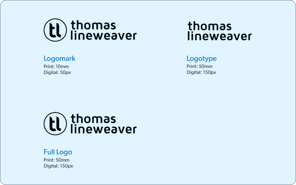
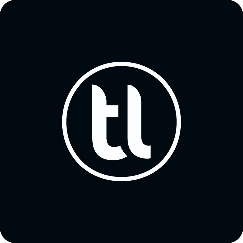
The Orbit is our logo.
It’s an iconic visual mark that represents Thomas Lineweaver. Bold at any scale, it clearly communicates his brand wherever it appears.
The Orbit overview
The Orbit is Thomas Lineweaver’s most recognizable symbol, a bold, instant expression of his brand.
Use it as a compact identifier in spaces like social media avatars, favicons, or when the brand is well-established.
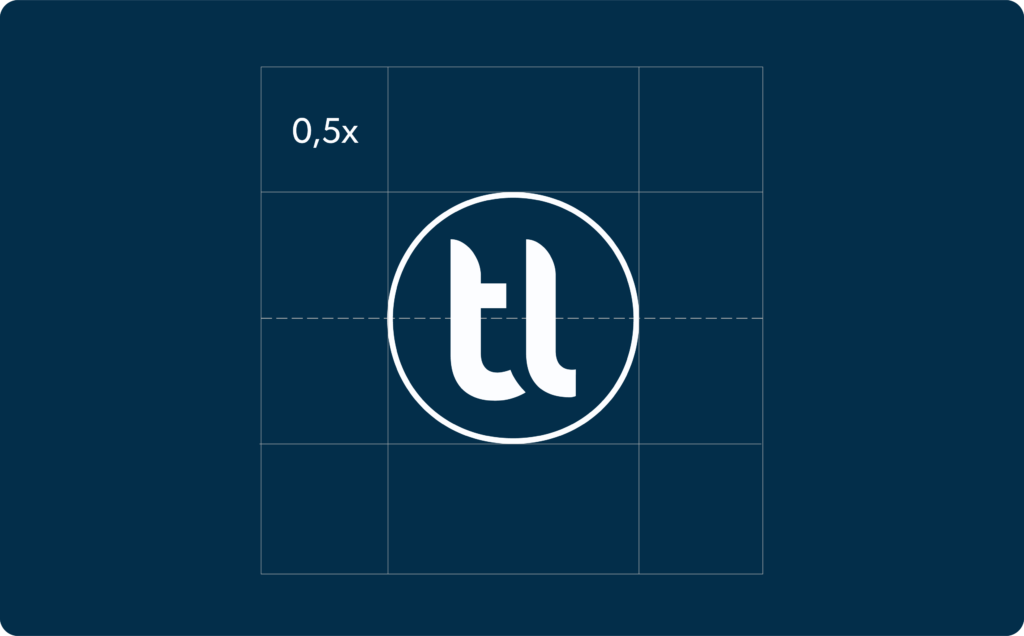
Minimum size
The minimal margin around the logomark is equivalent to 0,5x the symbol proportion. This ensures that there is an appropriate amount of empty space, preserving the symbol’s integrity and visibility.
Icon backgrounds
The minimal margin around the symbol is equivalent to 0,5x the symbol proportion. This ensures that there is an appropriate amount of empty space, preserving the symbol’s integrity and visibility.

Logotype
The logotype is our brand name in its custom typographic form. As our primary identifier, it is designed for maximum clarity and impact across all communications.
Full logo
The primary logo combines our wordmark and logomark. This is the default and most-used version of our logo, ensuring immediate brand recognition.
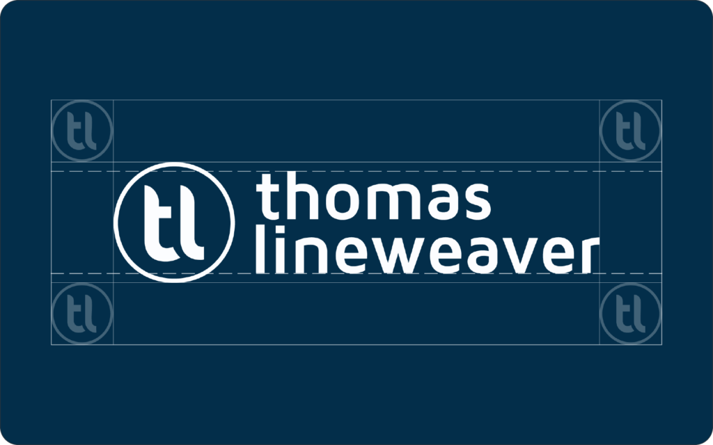
At times, the logo may be used using white color over a Yale Blue background to create a tight, solid lockup.
Minimum size
To ensure legibility, our logo must not be reproduced at sizes smaller than those specified here.
Adhering to these minimums for print and digital use is essential for brand integrity.
Clearspace
The minimal margin around the logo is equivalent to 0,5x the symbol proportion. This ensures that there is an appropriate amount of empty space, preserving the symbol’s integrity and visibility.
The wordmark is never used without the Orbit; however, the Orbit may be used alone in graphic applications.
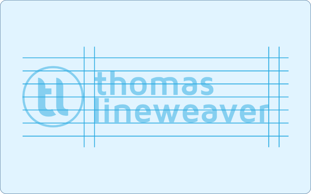
Construction grid
The logo is built on a precise construction grid. This framework defines the exact proportions and spatial relationships of its elements, ensuring its form remains consistent everywhere.
Lockups
For situations where our core lock-up isn’t the right fit, we may employ one of our alternate lock-up color combos.
Fallback
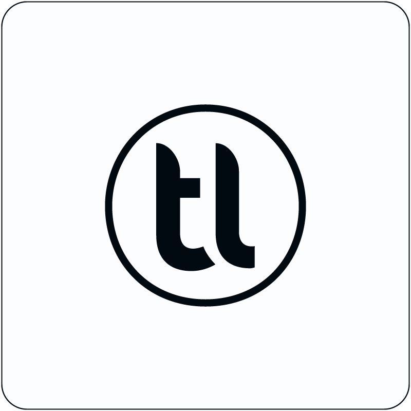
Black and white
In situations where using color is absolutely impossible we can resort to using the symbol in pure black and white.
Color palette
Color is a fundamental element of brand identity, evoking emotion and setting the tone for visual communication. Our logo is divided into three separate, yet distinctive colors, each one used when the situation for it.
Our primary color, Orbit Blue, forms the foundation of our brand, while our secondary color, Yale Blue, is used on letterhead. Ink Black, our fallback is used for text and print.
These custom shades provide flexibility for a vibrant and dynamic visual language.
Orbit Blue
(Primary)
HEX: #0772B9
RGB: 007, 114, 185
HSL: 204°, 93%, 38%
Yale Blue
(Secondary)
HEX: #032E4A
RGB: 020, 066, 112
HSL: 210°, 70%, 26%
Orbit Black
(Fallback)
HEX: #010B13
RGB: 001, 011, 019
HSL: 207°, 90%, 4%
Website color palette
Our website utilizes our primary brand colors. Additionally, our other branded color visuals are added to create a more cohesive look and feel to our digital presence.
Orbit Blue
HEX: #0772B9
RGB: 007, 114, 185
HSL: 204°, 93%, 38%
Platinum
HEX: #E1E6EA
RGB: 225, 230, 234
HSL: 207°, 18%, 90%
Yale Blue
HEX: #144270
RGB: 020, 066, 112
HSL: 210°, 70%, 26%
Blue Slate
HEX: #476986
RGB: 071, 105, 134
HSL: 208°, 31%, 40%
White
HEX: #F9FCFF
RGB: 253, 252, 255
HSL: 210°, 100%, 99%
Jet Black
HEX: #252E36
RGB: 037, 046, 054
HSL: 208°, 19%, 18%
Alice Blue
HEX: #E1F0FF
RGB: 225, 240, 255
HSL: 210°, 100%, 94%
Ink Black
HEX: #010B13
RGB: 001, 011, 019
HSL: 207°, 90%, 4%
Website accent colors
In addition to our primary brand colors, we may use our accent colors. These colors are exclusively used in our graphics and digital platforms.
Cobalt Blue
(Link Color)
HEX: #0042A9
RGB: 000, 066, 169
HSL: 217°, 100%, 33%
Logo misuse
Do not skew or stretch the logo. The proportions of the logo should not be altered in any way.
Do not change the colors of any individual character of the logo.
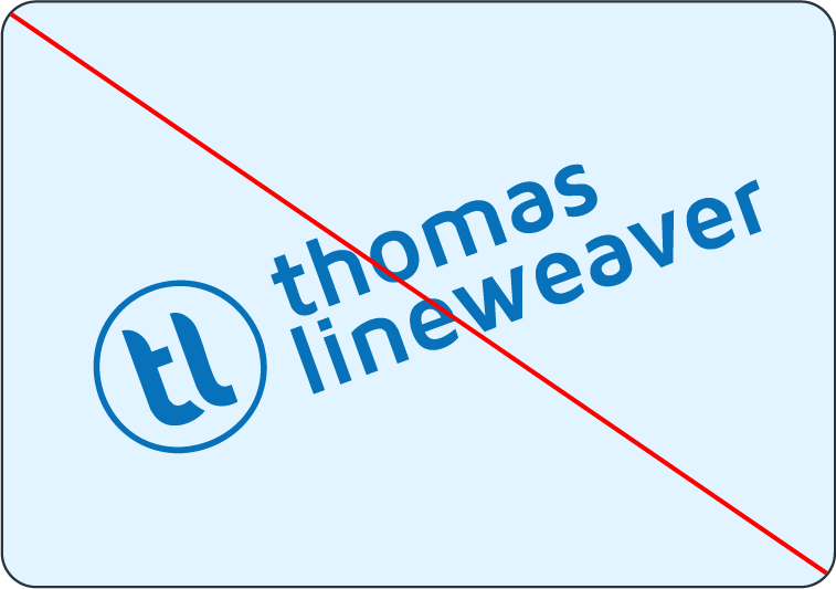
Do not change the orientation of the logo by rotating it.
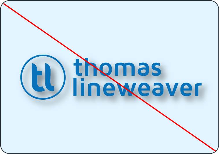
Do not add any kind of effects, like a drop shadow, to the logo.
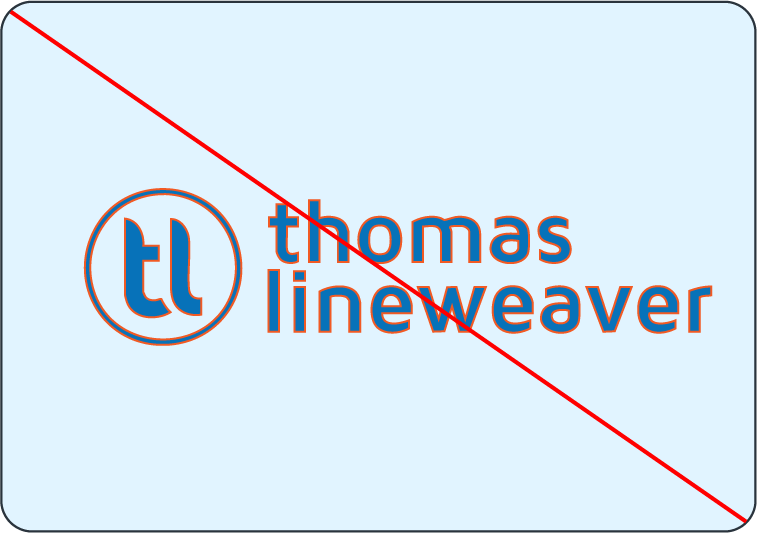
Do not apply strokes on the logo.
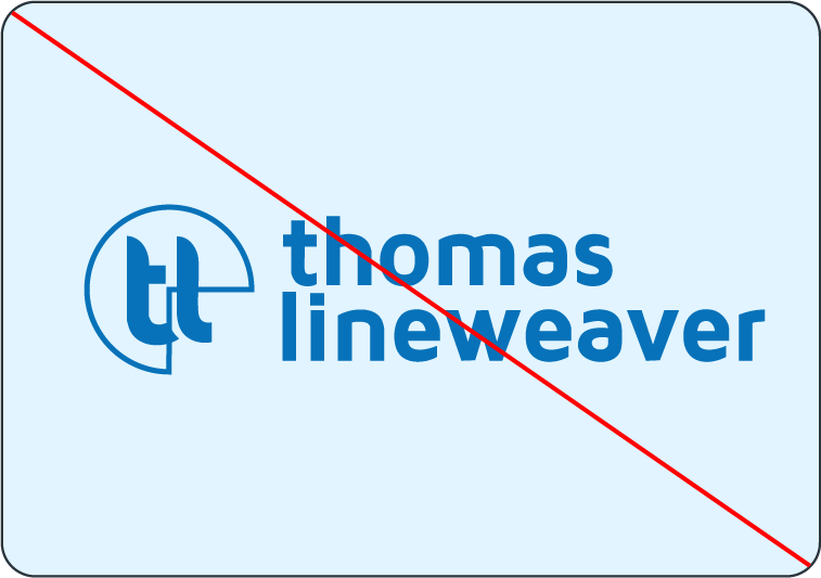
Do not modify any parts of the logo.
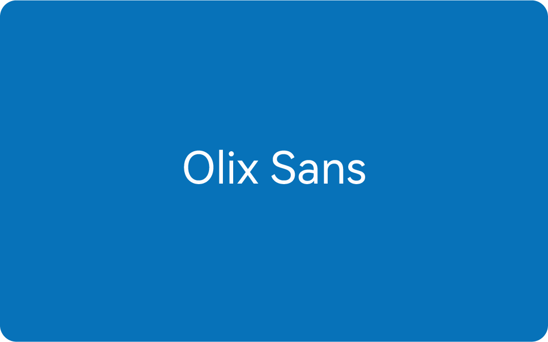
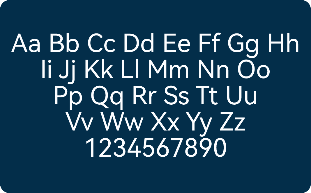
Typography
Our brand typeface is Olix Sans*, and the font was created entirely in-house. Its clean, modern, and highly legible letterforms reflect our brand’s personality: confident, clear, and approachable.
This versatile font family is used across all brand communications to created a consistent and unified typographic voice.
Type Hierarchy
Our type hierarchy uses distinct weights and sizes to create clear and scannable content. Follow structure for headers, sub-headers, and body text to ensure legibility and consistency.
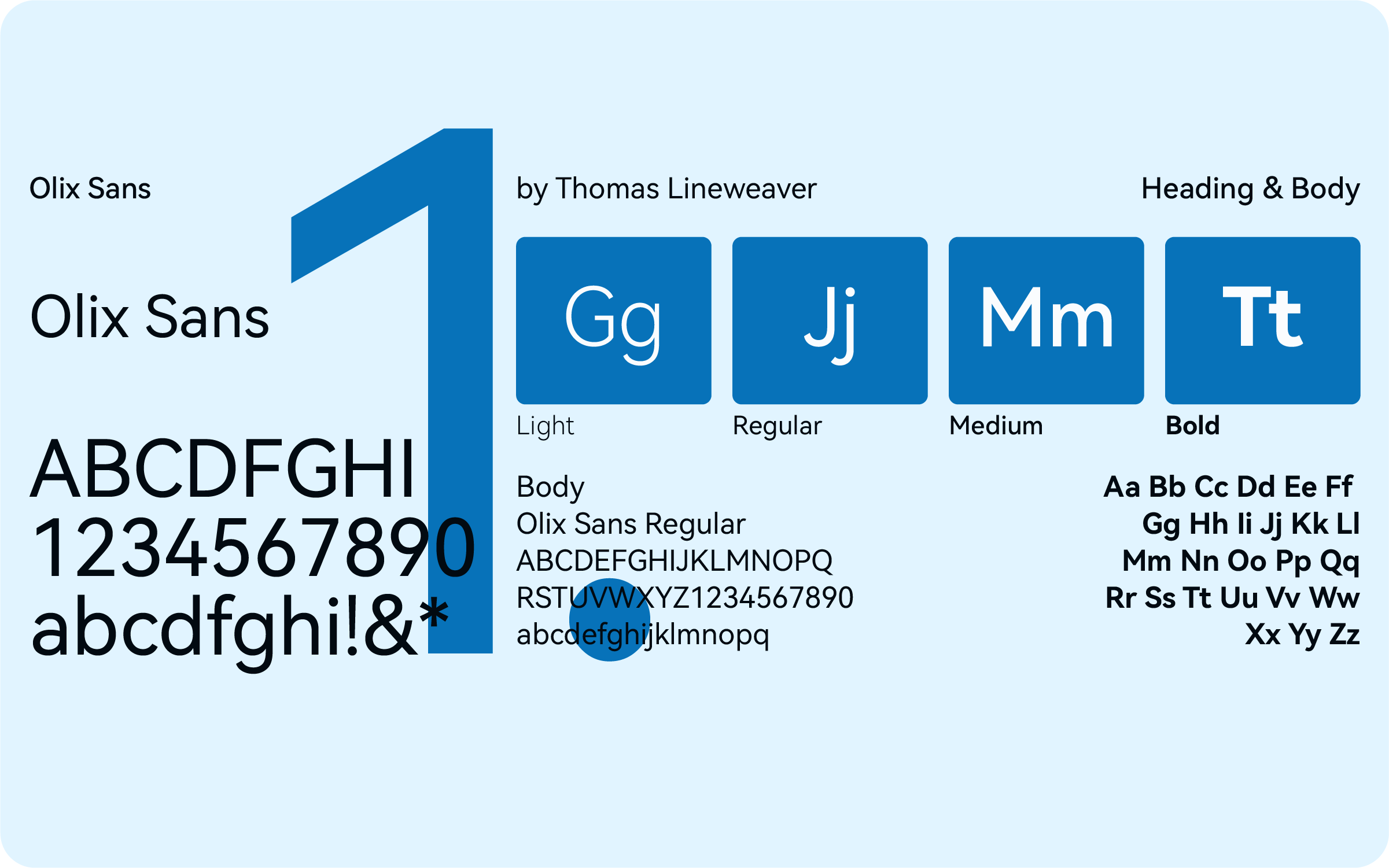
*Olix Sans is a custom typeface, made exclusively by Lineweaver Creative. It is only available by request at contact@tommyclineweaver.com. A public version of Olix Sans to be released July 1, 2026, including an exclusive Condensed version for web headers.
Last Updated: May 15, 2026